Last time I wrote that data collected from connected machines and stored can support predictive maintenance and add valuable inputs for you to improve your product design.
However, it is good to have a basic understanding of how this works and one need not be a statistician to know the basic concepts. Today we will see how control charting technique can be used to create a model to control a single characteristic like temperature which is not dependent on any other factor. In a later article we will find out how to predict a value of one factor by measuring another factor on which it is dependent upon.
Say, the temperature of a refrigerated truck carrying medicines is required to between 15⁰C and 20⁰C, with a tolerance band of 5⁰C and mean of 17.5⁰C. This means that you would not want the temperature to cross the upper and the lower limits consistently.
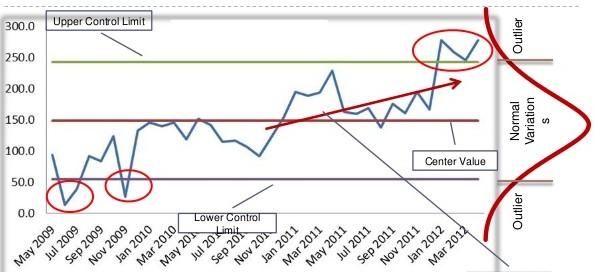
Usually, such a time series data follow something called a normal distribution in statistics and is represented by the famed bell-shaped curve. In such a case, there is a process control technique called the control chart which allows you to calculate the upper and lower control limits of the temperature based on the variation in the process. If the temperature control system is good, meaning the variation is less, the upper and the lower control limits will actually be within the specified limits of 15⁰ and 20⁰ centigrade thus narrowing the band from 5⁰C to say 4⁰C.
Based on these control limits you may now set your analytics program to alert you based on certain rules so that you may ensure the regulation of the temperature back to the specified range if an anomaly occurs. A rule can say that as soon as the recorded temperature breaches the upper or the lower control limit an alert is generated (stringent rule). Or it may say that, generate alert only if three consecutive readings breach a limit (less stringent rule).
A rule may also be set that if more than, say, five consecutive readings are above or below the mean line (17.5⁰C) an alert is sent, even though the values are within the control limits. The interpretation is that since the mean has shifted there is a likelihood of the temperature breaching the upper or lower limit depending on which side the mean has shifted.
Similarly, there is the trend rule, where, if several readings display a trend that the temperature is moving upwards or downwards an alert be generated, even though the values maybe within the control limits. Here also the interpretation is that since the temperature is moving upwards or downwards it is likely that it will breach the limits.

Designed by W3Squad